What We’ll Cover in This Article:
Spring is here, but if your marketing still looks like it’s stuck in last year’s inbox—or worse, last decade’s mailbox—you’re losing attention and conversions. For small business owners, financial advisors, healthcare providers, and service-based entrepreneurs relying on direct mail marketing and event-driven outreach, your visuals and landing pages need to evolve with the season to stay relevant. In this article, we’ll break down fresh, high-performing postcard examples, actionable landing page best practices, and the strategic psychology behind seasonal design—so you can turn more heads and drive better results this spring.
TL;DR: Spring is the perfect season to breathe new life into your direct mail and digital marketing game. This post covers high-performing postcard examples, landing page best practices, seasonal design tips, and tools to elevate your spring marketing campaigns.
Spring isn’t only about purging your wardrobe and hoarding antihistamines like a pollen-fearing squirrel. It’s also the perfect season to refresh your direct mail marketing strategy with bold visuals, clear messaging, and—yes—high-converting postcard examples and landing pages that actually work.
Whether you’re targeting clients in financial services, healthcare, real estate, or local service-based businesses, your creative needs to look—and feel—fresh. Because if your spring campaigns still look like they were built in a rush during Q4 panic, you’re not just being ignored… you’re being recycled.
Why Spring is the Season for Better Design
Spring signals renewal, and your audience expects exactly that—especially when they’re sorting through their mailboxes. Creative that’s refreshed for the season doesn’t just catch eyes—it gets results.
Data-backed reason to care:
- According to the 2023 ANA Response Rate Report, direct mail campaigns sent to house lists delivered an impressive 161% return on investment, outperforming every other channel. But here’s the catch: that only works if your mail doesn’t feel like it’s been sitting in a drawer since last fall.
- And once that postcard drives someone online? The HubSpot Marketing Stats remind us that most landing pages convert at less than 10%. Meaning: even small design improvements—like timely visuals and mobile-first layouts—can make the difference between a bounce and a buyer.
Spring is when people declutter, refresh, and reset. Your design should do the same.
Postcard Examples for Spring Marketing That Actually Convert
You’re here for ideas, right? Not theory. So let’s talk postcard examples that are built to perform in the real world.
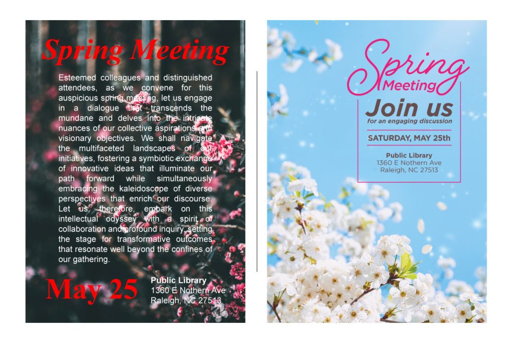
Old postcard:
- Overly dark tones, cluttered copy, and a complete lack of design flow.
- CTA buried in a sea of jargon
- Fonts last seen on a 2007 invoice
Refreshed postcard for spring:
- Bright, seasonal colors (think green, sky blue, soft peach)
- Clean layout with visual breathing room
- One powerful CTA and modern postcard font for easy reading
These postcard examples aren’t just pretty—they’re functional. Designed for real results, not a designer’s portfolio.
Real Postcard Examples That Work (And Why They Do)
You don’t need a museum piece. You need a postcard that gets noticed, gets read, and—most importantly—gets scanned, clicked, or called. Here’s what separates the recycling-bin filler from the response rate winner:
1. The Minimalist Tease
What it looks like:
Large seasonal image (think spring blossoms, green lawns, happy people doing things), one bold headline, minimal copy, and a single, easy-to-read CTA like “Get Your Free Estimate” or “Book Your Spring Check-Up.”
Why it works:
It’s scannable in 3 seconds or less, which is about how long most people give your mail before they decide to bin it or pin it.
Best for: Home services, health clinics, and real estate
2. The Problem-Solver
What it looks like:
Front: A compelling problem-based headline (“Allergies Again? Let’s Fix That.”)
Back: Benefits in bullet form, short testimonial, QR code leading to a landing page with an offer
Why it works:
People love when brands solve their problems, especially if you show empathy and usefulness fast. Combine that with easy access to a digital next step = conversion city.
Best for: Healthcare, fitness, local services
3. The Seasonal Statement Piece
What it looks like:
Bright spring colors (pastel palette, not neon rave), custom illustrations or playful fonts, and cheeky copy that’s actually fun to read. Think: “We Spring Cleaned Our Rates—You’re Gonna Like This.”
Why it works:
Memorability = staying power. This one’s for brands with a personality (and a decent design budget). It catches the eye and sticks in the brain longer than the average coupon sheet.
Best for: Creative agencies, boutiques, salons, subscription products
4. The Offer-Driven Hero
What it looks like:
Big headline with the offer (“Get 20% Off Spring Services”), a clear expiration date, visual of the product or service in use, and a CTA that doesn’t hide (“Claim My Discount”).
Why it works:
Offers work—especially when there’s a sense of urgency. Adding a QR code or a short, memorable URL keeps your audience moving to your landing page, where the magic happens.
Best for: Retail, SaaS trials, seasonal promos
Pro Tip: All of these examples pair best with a landing page that matches the visual tone and message. If your postcard says “fresh,” but your page says “corporate WordPress template from 2014,” that’s a conversion crime.
You don’t need to reinvent direct mail. You just need to respect what works:
- One message
- One offer
- One next step
If it all feels like there are a thousand ways to do it “right,” that’s because there are—but most of them still lead to the recycling bin. Keep it simple. Smart. Spring.
Want to create one of these in 48 hours without accidentally designing something that looks like an office party invite from 2006? You know where to find us. Let’s Build a Postcard That Works
Need design inspiration? Head to top design inspiration sites like:
- Dribbble for sleek visual layout ideas
- Awwwards for coolest websites
- SiteInspire for UI flow and clean structure
Want help with design or execution? Check out our direct mail services.
Direct Mail to Digital: Connecting Postcards to Landing Pages
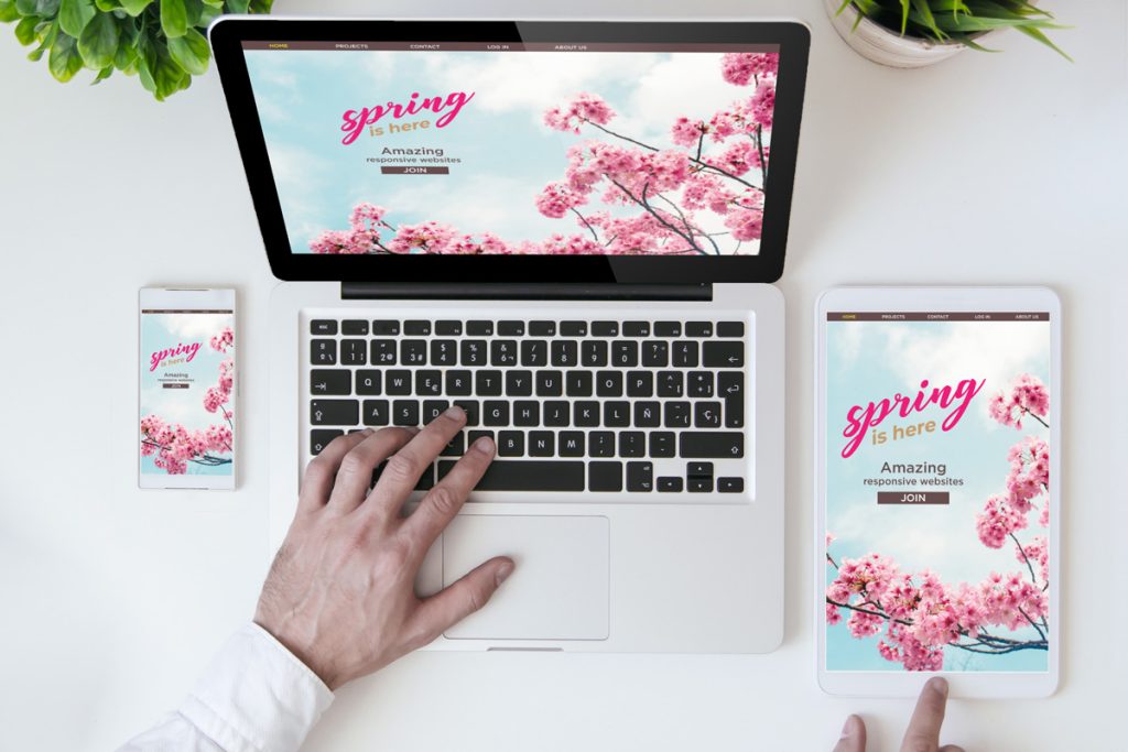
What happens after someone loves your postcard? Hopefully, they visit a landing page that doesn’t kill the vibe. Your page should be clean, fast, and mobile-optimized. Here’s how to avoid the top pitfalls:
Landing Page Best Practices:
- One clear offer with a matching headline
- Short forms (3 fields or fewer unless you’re conducting a census)
- Fast load speeds—especially for mobile users
- Branding that visually connects to your direct mail marketing piece
- A strong, clear CTA above the fold
Want help? That’s why landing page design experts exist—to rescue you from yourself. (Hi, we’re Plum.)
And yes, you can absolutely draw creative inspiration from product landing page trends across e-commerce, SaaS, and service industries. Just don’t try to reinvent the wheel. Steal smart.
Ready to refresh your postcards and landing pages? Start your refresh now with us.
Design Tools, Talent, and Spring Marketing Ideas That Actually Work
Because no one wants to be the person using WordArt in 2025, here’s what we recommend:
- Best graphic design programs: Adobe Illustrator, Figma, Canva Pro
- Hire a marketing designer with experience in advertising graphic design
- Browse cool sites for page layout examples and design inspo
- Work with a web marketing graphic designer who knows your industry
I know, that sounds exhausting. Don’t worry, we’ve got it covered, we can do it for you.
The Psychology of Seasonal Design
Okay, now let’s get deep for a minute. Why does seasonal design actually work?
Because humans are weirdly wired to pay attention to what feels timely and “new.” Spring colors like green, blue, and yellow activate feelings of optimism and freshness (yes, we looked this up). Combine that with sharp messaging and intuitive UX, and your campaign speaks to both the heart and the brain.
Your design isn’t just decoration—it’s a psychological nudge. And if you’re ignoring that? You’re leaving money in the mailbox.
FAQs
How do I know if my current postcard designs are underperforming?
If your response rate is flat or below 1%, your visuals or offer likely need a refresh. Use A/B testing with updated postcard examples to compare performance.
How do I keep branding consistent across print and digital?
Start with one unified creative brief. Use the same color palette, fonts, messaging tone, and visual direction across direct mail, landing pages, email, and even your social ads.
What’s the biggest mistake small businesses make in spring campaigns?
Going generic. “Spring Sale” isn’t a strategy. Speak to your audience’s actual needs with a seasonal spin—not just clichés and pastel bunnies.
What if I don’t have time or a designer on staff?
That’s why agencies like Plum exist. We bring strategy, execution, and all the marketing graphics you need without you having to download a single font.
Let’s Make Spring Campaigns That Work — with bold design and the right spring marketing ideas to match.
If your spring marketing ideas are stuck in neutral, it’s time to call in the pros. At Plum, we create direct mail and landing page experiences that are aligned, strategic, and designed to convert.
Let Plum handle your spring creative refresh—postcard design, landing page build, and all the strategy in between.
You worry about your offers. We’ll worry about the fonts. Let’s build your spring creative together
Need more ideas? Catch up on our spring series:
Part 1 – How to Refresh Your Strategy with Digital & Direct Mail
Part 2 – Spring-Clean Your Email Marketing Journey