What We’ll Cover
Today, over 60% of your leads are scanning QR codes, clicking links, or visiting landing pages from their phones. But many campaigns still aren’t built for mobile, which leads to high bounce rates and lost conversions. If you use direct mail, digital ads, or a mix of both, this matters more than ever. People now expect a smooth, mobile-friendly experience. In this article, you’ll learn how a responsive landing page can make things easier for users, build trust, and boost your conversions. We’ll also share practical tips—like using QR codes, short sign-up forms, and mobile-friendly calls to action.
Ignoring Mobile Users: The Underestimated Pitfall in Direct Mail & Digital Campaigns
Quick Stat: A Statista report shows over 60% of all emails and web visits now occur on mobile devices—yet a surprising number of direct mail call-to-actions and responsive landing pages still aren’t optimized for small screens. Meanwhile, a 2023 Adobe survey found that 74% of users will abandon a site if it’s not mobile-friendly within 5 seconds of landing on it.
Why Mobile Matters—Even for Direct Mail
You might think “mobile responsiveness” only matters for digital ads or email campaigns. But if your direct mail flyer includes a QR code or website link, many recipients will either scan or type it in on their phone. Picture this: they’ve just opened your mailer, are intrigued by your workshop or offer, and whip out their smartphone to learn more. If the landing page is clunky, loads slowly, or forces them to pinch-and-zoom, your prospect may bail on you right there.
Remember: The first impression of your online presence often begins on a phone. If you botch that, they may never bother checking you out on a desktop
The Mobile-First Funnel: A Missed Opportunity
- Direct Mail to QR: Thanks to QR codes making a comeback during the pandemic, linking offline to online has never been easier. But those scans are almost always done on a phone, not a laptop.
- Mobile Email Follow-Ups: After someone gets your postcard, they might receive a follow-up email—like a confirmation or a reminder. They’ll often check it on their phone—not their desktop. If your layout is cluttered or the font is minuscule, even a responsive landing page can underperform if poorly designed.
- One-Tap Registration: If you’re running a webinar or event, a single-tap sign-up form can dramatically boost conversions on mobile. Conversely, a multi-step, cramped form with tiny buttons can tank an otherwise solid campaign.
Real Costs of Neglecting Mobile
High Bounce Rates
- A mobile-unfriendly landing page leads to immediate exits. If a user can’t read or navigate your site within seconds, they’ll go back to scrolling social media.
- Impact: You pay for printing, postage, and design—only to have prospective clients abandon you within moments of visiting your link.
Brand Credibility Hit
- Your direct mail may look sharp, but if your mobile site feels outdated, prospects might question the quality of your services too.
- Impact: When your site looks unprofessional, it can hurt trust—especially in your financial services or event invites.
Wasted Ad Spend
- It doesn’t matter if traffic comes from Google, Facebook, or a direct mail piece. If your site isn’t mobile-friendly, your cost per conversion can go up. You spend more but close fewer leads.
- Impact: Your ROI plummets as valuable prospects slip through the cracks.
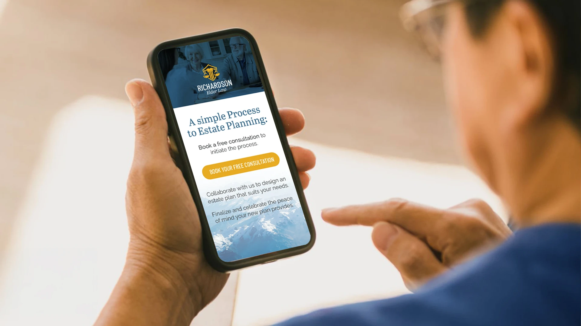
A Responsive Landing Page Readiness Checklist.
How can you ensure you’re not leaving mobile users in the dust? Consider these essential checkpoints:
Page Load Speed
- Aim for under 3 seconds—every second longer can lead to a 20% drop in conversions (per Think with Google).
- Compress large images and minimize heavy scripts.
Responsive Design
- Test your responsive landing pages and forms on many devices—iPhone, Android, tablets. Check portrait and landscape modes.
- Ensure buttons are large enough for a thumb to tap without zooming.
Easy-to-Spot CTA
- Make sure your main action button (e.g., “Sign Up,” “Learn More”) is “above the fold,” meaning users see it immediately without scrolling.
- Bonus: Use clear language like “RSVP Now” or “Get Your Free Quote” to drive instant action.
Short, Simple Forms
- If you’re collecting sign-ups, limit the number of fields. Just ask for basics—like their name, email, and one simple question that really matters.
- Reduce friction—nobody wants to type an essay on a phone.
Consistent Branding
- Match the aesthetics of your direct mail piece—colors, fonts, imagery—to your landing page.
- Consistency = trust. It reassures users they’re in the right place.
Real-World Example: A Postcard Redemption Gone Right
A mid-sized insurance company sent 10,000 postcards offering a free final-expense consultation. The postcard included a QR code leading to a specialized landing page. Here’s what happened initially:
Phase 1:
QR scans: High (good sign!).
Website conversions: Low (bad sign!).
Why? The landing page was slow to load and the form was too long—eight fields on a single page.
Phase 2 (Improvements):
They redesigned the site to work better on phones. The new landing page was cleaner, loaded faster, and had fewer form fields.
Cut the form down to three essential fields.
Tweaked images for faster loading and placed a single CTA button at the top.
Result: Conversions more than doubled, and time spent on the page increased by 45%. Better yet, they recorded a 30% jump in booked consultations over the previous campaign.
Overcoming Common Excuses
1. “Our Audience Is Older—They’re Not On Mobile.”
Actually, smartphone use among older adults is rising steadily. Plus, adult children may check these offers on behalf of a parent—using their phone.
2. “We Don’t Have the Budget for a Site Redesign.”
Start small. Compress your images. Use a simple drag-and-drop builder with mobile-friendly templates. Remove anything that slows people down—like long forms.
3. “Our Current Campaigns Work Fine.”
“Fine” isn’t good enough if you’re leaving a large segment of potential customers frustrated—or ignoring your brand altogether. There’s always room for growth.
Pro Tips for Direct Mail + Mobile Synergy
- Offer a Mobile-Exclusive Incentive Encourage recipients to scan the QR code with a line like “Scan to unlock a bonus tip sheet” or “Scan for a 10% discount.” This drives immediate action.
- Use Short URLs If you provide a direct web link, keep it short and simple—like “plum.co/offer.” People typing on mobile won’t bother with a super-long URL.
- Test, Test, Test Physically test your mailer’s QR code and link on many phones. If you hit any snags, your audience definitely will, too.
It doesn’t matter if your campaign is digital or print. It needs to work smoothly on a smartphone. That’s not a nice-to-have—it’s what people expect now. If your mobile experience is poor, many users will leave before they even read your message.
Key Takeaway: When every part of your campaign—postcard, email, and landing page—is made for mobile, good things happen. You’ll get more clicks, fewer drop-offs, and better results from your marketing.
Final Word

Overlooking mobile users isn’t a small mistake—it could cost you the entire deal. In a world where over 63% of web traffic comes from mobile devices (StatCounter, 2025), overlooking mobile users can cost you leads, conversions, and credibility. Take time to review your mobile funnel. Make your calls to action clear and simple. And build a responsive landing page that actually helps you get conversions.
Ready to Go Mobile-First?
Let’s talk about building a campaign strategy that puts smartphones front and center. Contact Us to schedule a consultation, or drop a comment below to share your own mobile-marketing successes (or disasters)!
Frequently Asked Questions (FAQ)
What is a responsive landing page?
A responsive landing page is a web page that adapts to any screen. It changes its layout and content so it looks and works great on phones, tablets, and desktops. It ensures users don’t need to zoom, scroll excessively, or struggle with buttons or forms.
What happens if my landing page isn’t mobile-friendly?
If your landing page doesn’t work well on phones, people will leave fast. That means a higher bounce rate and fewer conversions. In fact, Google reports that 53% of mobile users leave a site if it takes longer than 3 seconds to load.
Do QR codes really drive mobile traffic?
Absolutely. Most people scan QR codes with their phones, so the page they land on must be mobile-friendly. If your landing page isn’t responsive, you risk losing that user moments after they scan.
How can I optimize a landing page for mobile conversions?
Start with fast load times, large and easy-to-tap buttons, short forms, and a CTA placed above the fold. Also ensure your branding is consistent from your direct mail piece to your landing page to build trust and reduce friction.
What if my audience is older—do I still need mobile optimization?
Yes. Smartphone adoption among older adults is growing fast. Plus, younger family members often research or register on their behalf using mobile devices. Optimizing for mobile ensures accessibility for everyone involved.
How can I test if my landing page is truly mobile-ready?
Use tools like Google’s Mobile-Friendly Test, or manually test your page on many phones and screen sizes. Check that your site loads quickly, displays correctly, and allows easy interaction (e.g., tapping, scrolling, form filling).